







The photography that converts: when one image is worth dozens of enrolments
Why a course photo is not a concert photo, and how to choose the one that makes people enrol
In this article
An unambiguous figure
Sometimes it is enough to change a single photo. A quartet masterclass went from about 22 to 87 enrolments by changing only the main image on the listing — nothing else: same teacher, same programme, same price. It is not an isolated case.
Analysing 210,860 course-listing views in our database during 2024, one figure leaves no room for doubt: photos with teacher-student interaction generate 156% more clicks than any other type of image. Yet only 18% of organisers seem to have grasped it. Understanding why this happens is what separates a listing that converts from one that gets ignored.
The concert syndrome
There is a fundamental contradiction in the way we present classical music courses. On one hand we want to attract new students, make ourselves accessible, scrape off the elitist image that still surrounds this world. On the other we keep using photos that look like they came out of a major philharmonic's brochure from the eighties.
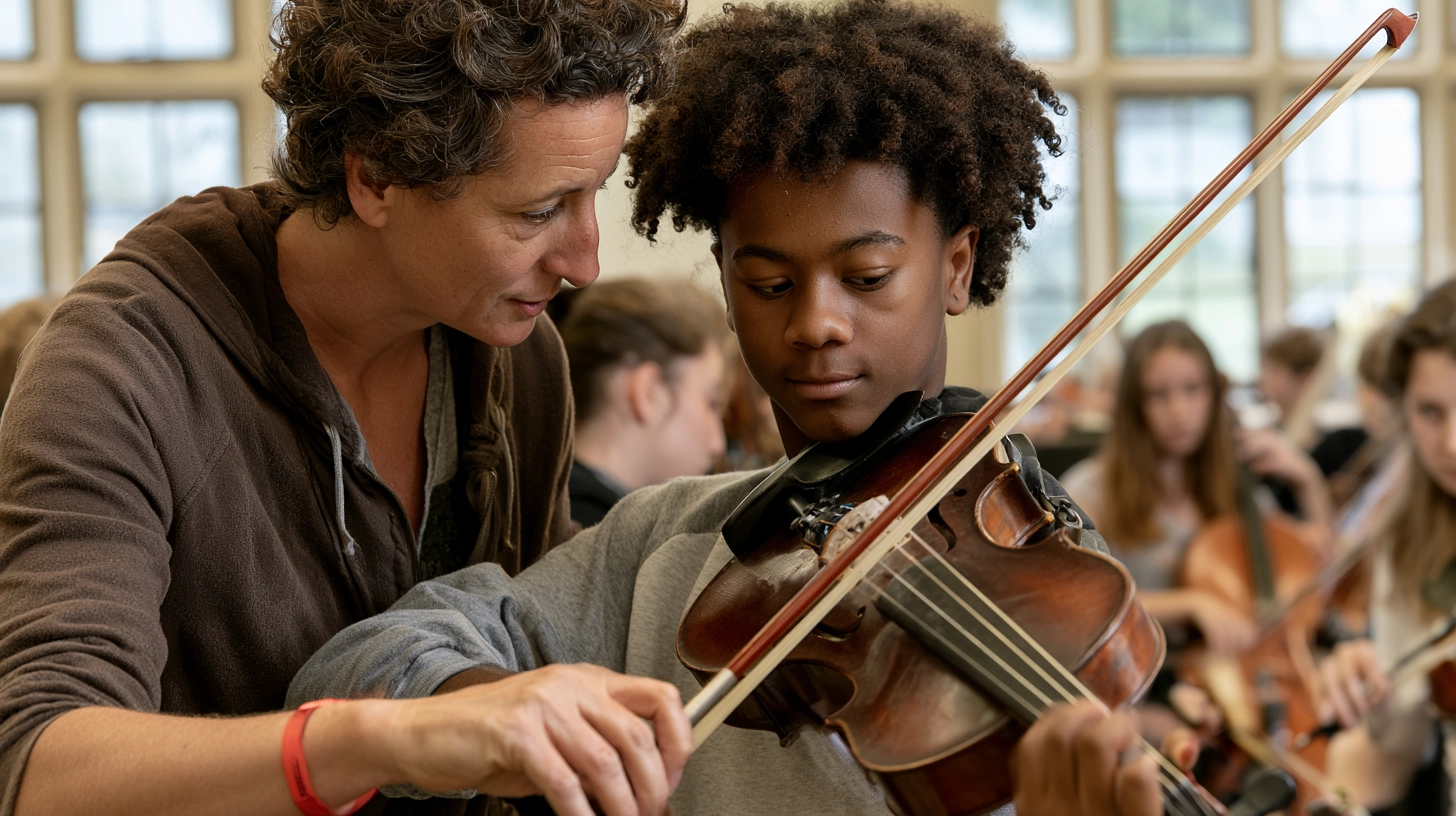
The most common problem is what can be called the concert syndrome: musicians in evening dress, on stage, theatrical lighting, reverential distance. Impressive, certainly. But a student looking for a course to improve their technique does not recognise themselves in that image — indeed, they are intimidated by it. The data confirms it: faced with musicians in tails on a stage, time on page drops by 4.2 seconds. When the photo instead captures a real teaching moment — the teacher correcting the bow position, the student focused on a hard passage — something different happens: the viewer projects themselves into that situation. They see themselves there, in that room, learning.
Before: the photo of the building
A string academy showed its historic building. With 3,400 views, it gathered 7 enrolments: the image conveyed prestige, but not the experience.
After: the correction in the room
With the photo changed to a young violist receiving a postural correction from the teacher, at the same traffic (3,520) enrolments rose to 31. Same course, +342%.
Tradition and accessibility
This is not about giving up the elegance and professionalism that distinguish classical music. The point is another, and it is a distinction as simple as it is overlooked: the photo of a concert and the photo of a course serve different purposes and speak to different moments. The first celebrates a result; the second must make people imagine a journey. Confusing the two means using the wrong language at the wrong moment.
The three elements of an effective photo
In the database, the best-performing images share three recurring traits. It is not a rigid formula, but a guide that works with surprising consistency.
What converting photos have in common
- Human interaction: never just instruments propped on a chair. There must be a visible relationship between people.
- A professional but not intimidating environment: a fine rehearsal room with natural light works better than an empty auditorium.
- A visible technical detail: the bow hold, the left-hand position, the angle of the cello. It is what the student recognises themselves in.
The three-second test
There is a quick and honest way to tell whether a photo works, and it needs neither tools nor analytics. Show your course image to someone who does not know it, and after three seconds ask: "What do you think this is?"
If the answer is "a violin course" or "a masterclass", the photo works. If it is "a concert" or "I don't know, classical music", you are communicating the wrong thing.
Three seconds is the real time a student gives a listing before deciding whether to stay or move on. If in that span the image does not say "you learn here", the best description in the world will reach a page that has already been abandoned.
An investment that pays for itself
"A professional photographer costs money," is the natural objection. True. But the return, in our database, is clear: every euro spent on suitable photography translates on average into twelve euros of enrolments. You do not need a Hollywood production: you need a photographer who understands the difference between documenting a concert and telling the story of learning, who can capture the moment of concentration when a student finally grasps a hard passage, and who shows professionalism without intimidation.
Operational conclusion
Next time you prepare a course's promotion, pause for a moment before the photo you are about to use and ask yourself a single question: if I were a student unsure of my abilities, would this image invite me in or make me feel inadequate? Look for human interaction, a welcoming environment and a technical detail; avoid the concert syndrome; and always run the three-second test before publishing.
The right photo does not describe the course: it invites the student to see themselves in it. And that is where the enrolment is born.
